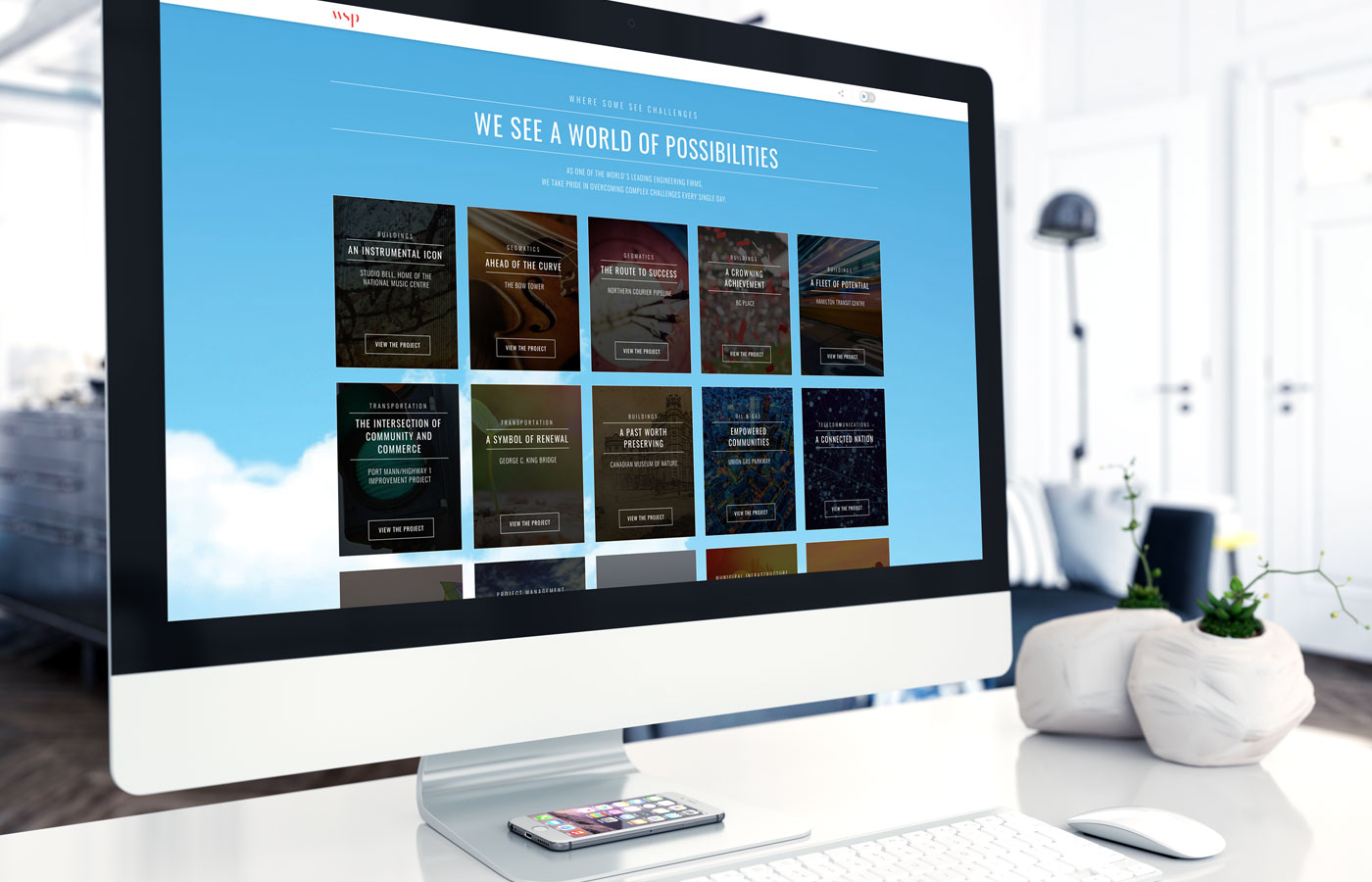
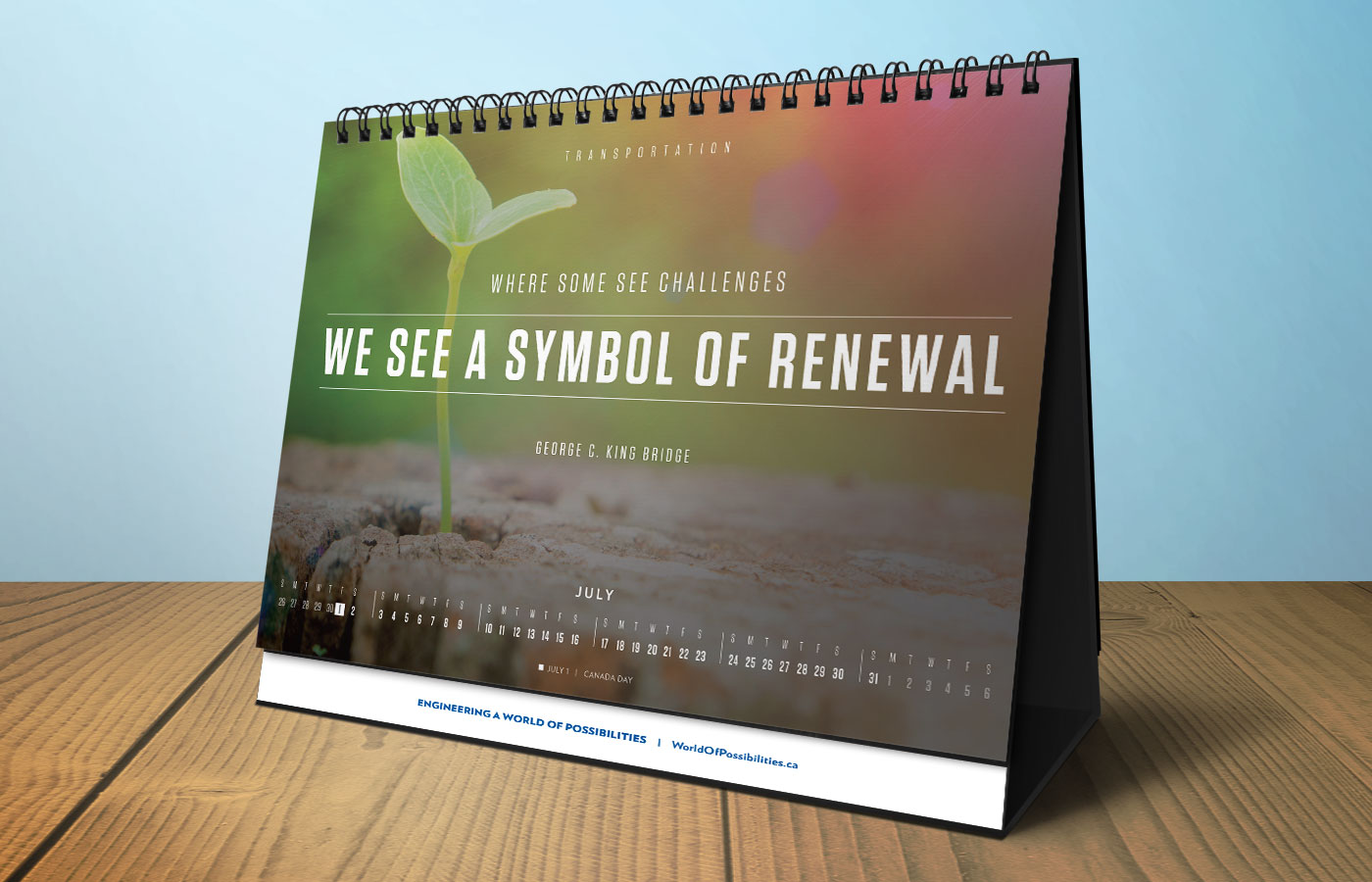
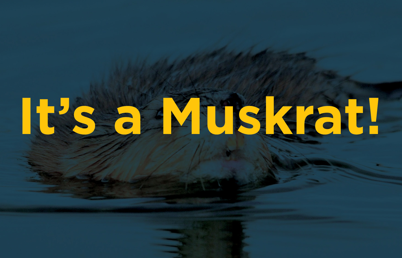
CashGuard
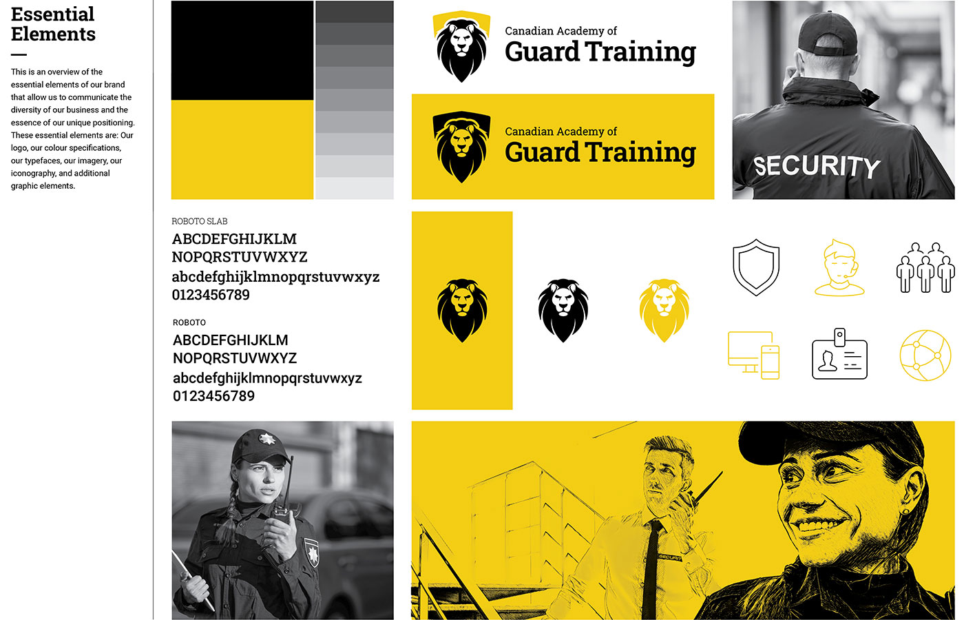
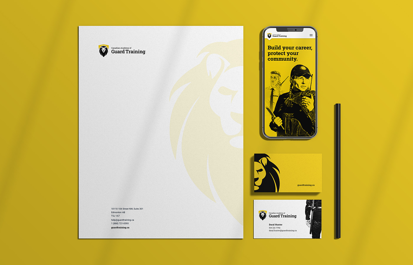
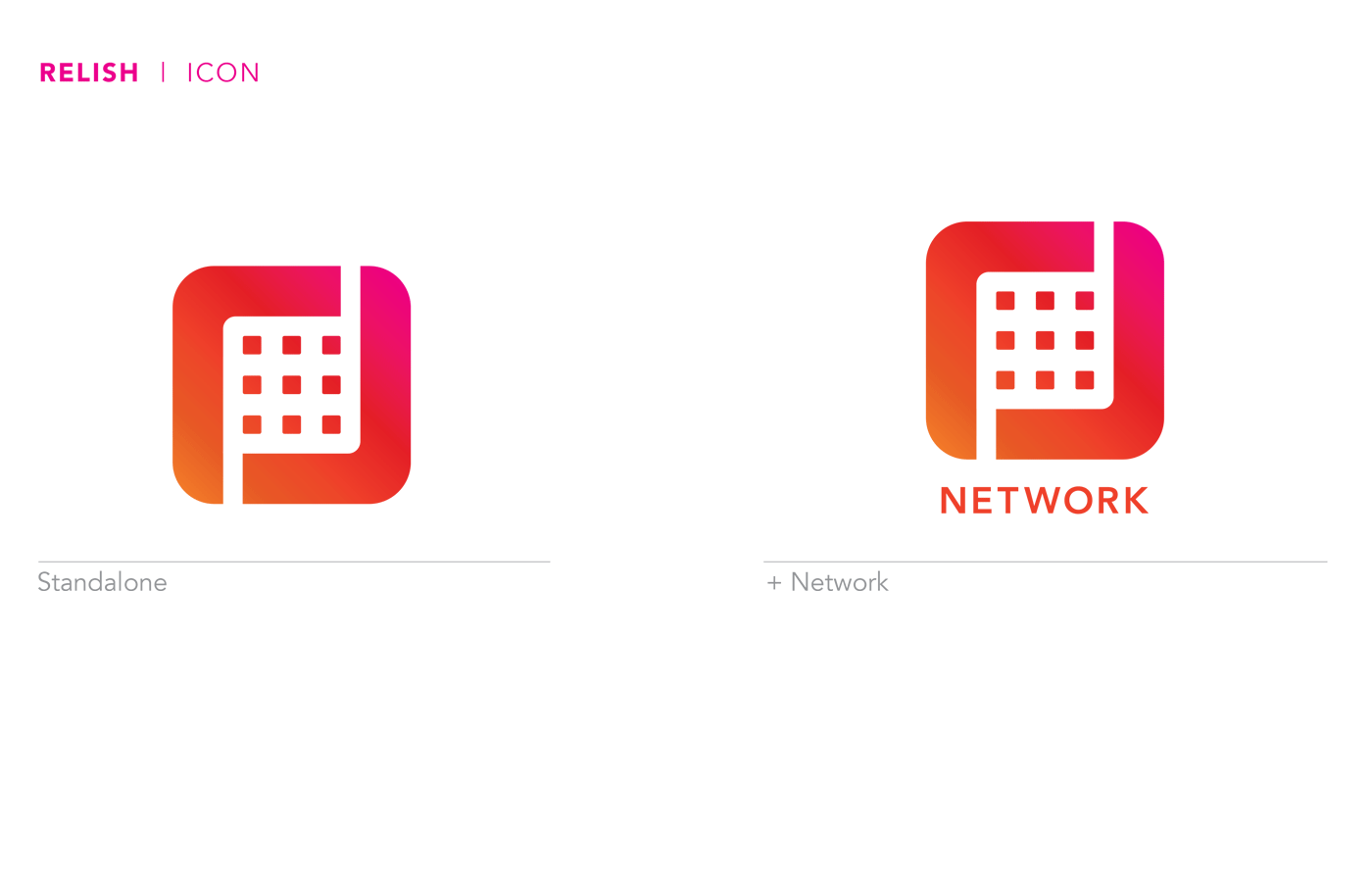
CashGuard, a start-up focused on easing the transfer of funds between contractors and their clients through a secure platform, contacted me to develop their new brand’s identity. The logo, comprised of a “C”, a “G”, a shield and a key, was designed to convey strength, security, trust and confidence. While the concept is complex, the resulting treatment is a clean, concise and cohesive mark that aligns to current trends in logo design, but will stand the test of time. The simplified black and yellow colour palette, accompanied by crisp black and white photography establishes Cashguard as an edgy, cool player in the secure payment industry.


